Optimizing IA & Navigation for the PEOPLE Program Website
Overview
As both a graphic design intern and a PEOPLE scholar, I noticed that the website for our non-profit academic organization was outdated and disliked by many, myself included. The site, an essential tool for engaging prospective and current students, was underused due to its clunky design and complex structure. Although I was initially focused on merchandise design for my job, I approached my supervisor with the idea of revamping the website to have a more direct impact on students. The project was approved, and I began redesigning the user experience, interface, and visual identity of the PEOPLE website.
Goals
The goal of this project was to analyze the current PEOPLE site and its users' needs to revamp the website, making it a key resource that boosts applications to the program and reduces user confusion and frustration.
Duration
4 months (8 hrs or less per week)
Team
Director
Website coordinator
Marketing supervisor
Graphic design colleague
Roles
UX Designer
UI Designer
UX Researcher
Toolkit
Figma
Abode Photoshop
Adobe Illustrator
Notion
Google Docs
Phase 1: Understand
Where do we begin?
As a designer and PEOPLE scholar, I noticed significant usability issues with the website, making it frustrating to navigate and find information. I decided to start fresh by researching how other organizations approached similar challenges.
Competitive Analysis
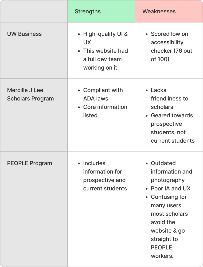
The PEOPLE program uses WordPress, mandated by UW, so I reviewed 10+ UW WordPress sites, focusing on two for my competitive analysis:
UW B-School site (known for its strong design
Mercilles J. Lee Scholars website, which is a similar program like PEOPLE.
I found that our site was lacking in several areas and identified that stronger UX and UI designs often involved custom coding.
Heuristic Evaluation & Website Analysis
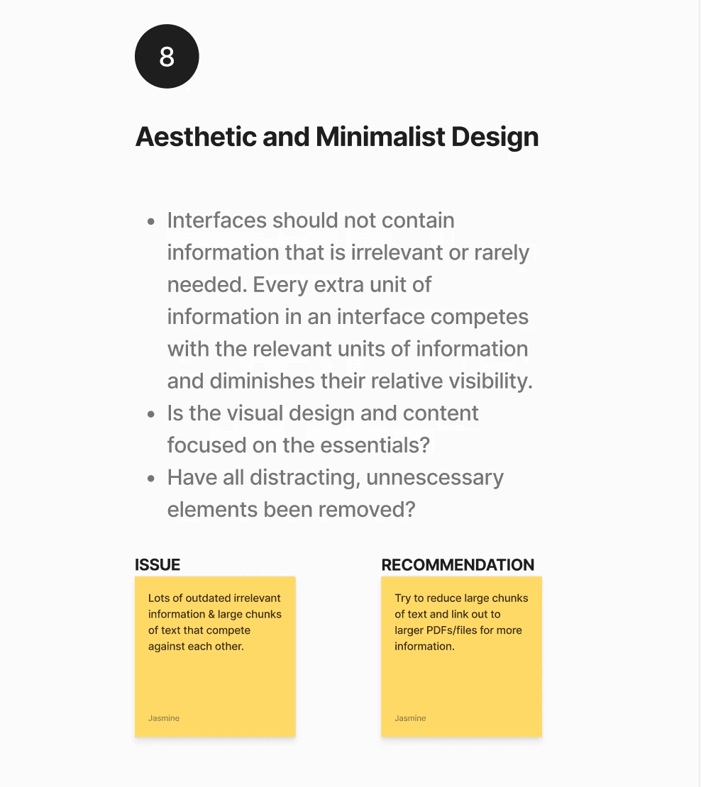
After meeting with my supervisor, I independently reviewed all 15 pages of the site while taking notes and performed a heuristic evaluation.
Below are some key issues I identified.
01
Lack of clear user flow and organization.
02
Many links were inaccessible and poorly organized across the site.
03
The layout ignored basic UX principles and was cluttered with information users likely overlooked.
Discussion with team
After reviewing the website and allowing time for staff to take notes, I led a meeting with the team to discuss our goals and plans for the redesign.
01
Simplifying navigation and content structure to emphasize the 2 programs under the PEOPLE program.
02
Improving clarity of program information for students and parents.
03
Resolve user pain points based on staff feedback from their interactions with students and parents.
Phase 2: Define
Defining Our Users
After collaborating with the team and conducting my own research, I defined the key user pain points and set the foundation for the redesign.
Who are we creating solutions for?
Primary Audience: Prospective or current PEOPLE students and parents
Secondary Audiences: Alumni & PEOPLE staff
User pain points + goals
Despite numerous accessibility issues, I distilled my research into three key pain points that will drive the final design.
Pain point:
The website's IA failed to clearly distinguish between the program's two branches, causing user confusion.
Goal:
Clear up confusion about program with redesign.
Pain point:
Users struggled to navigate the information on the website and often contacted PEOPLE for clarification.
Goal:
Users should be able to use the website without external help from PEOPLE.
Pain point:
The layout, HTML tags, and overall design did not comply with ADA guidelines, which is a concern for a program that has students with disabilities.
Goal:
Create an ADA-compliant platform that is accessible for prospective and current students.
Phase 3: Ideate
Reorganizing the Website IA and Content
The heart of this redesign is redoing the website’s IA and optimizing it to better serve students/parents and the PEOPLE program application process.
Connecting goals to solution ideas
With my goals defined, I wanted to define the solutions that the designs were going to be based on.
Goal:
Clear up confusion about program with redesign.
Solution:
Reorganize the IA and navigation to highlight the three branches and enhance clarity and usability.
Goal:
Improve the UI and UX to make information more digestible and improve user comprehension.
Solution:
Analyze and improve the UI and UX to make information more digestible and improve user comprehension.
Goal:
Create an ADA-compliant platform that is accessible for prospective and current students.
Solution:
Use wordpress accessibility features and verify code is accessible according to W3C standards.
Sitemapping
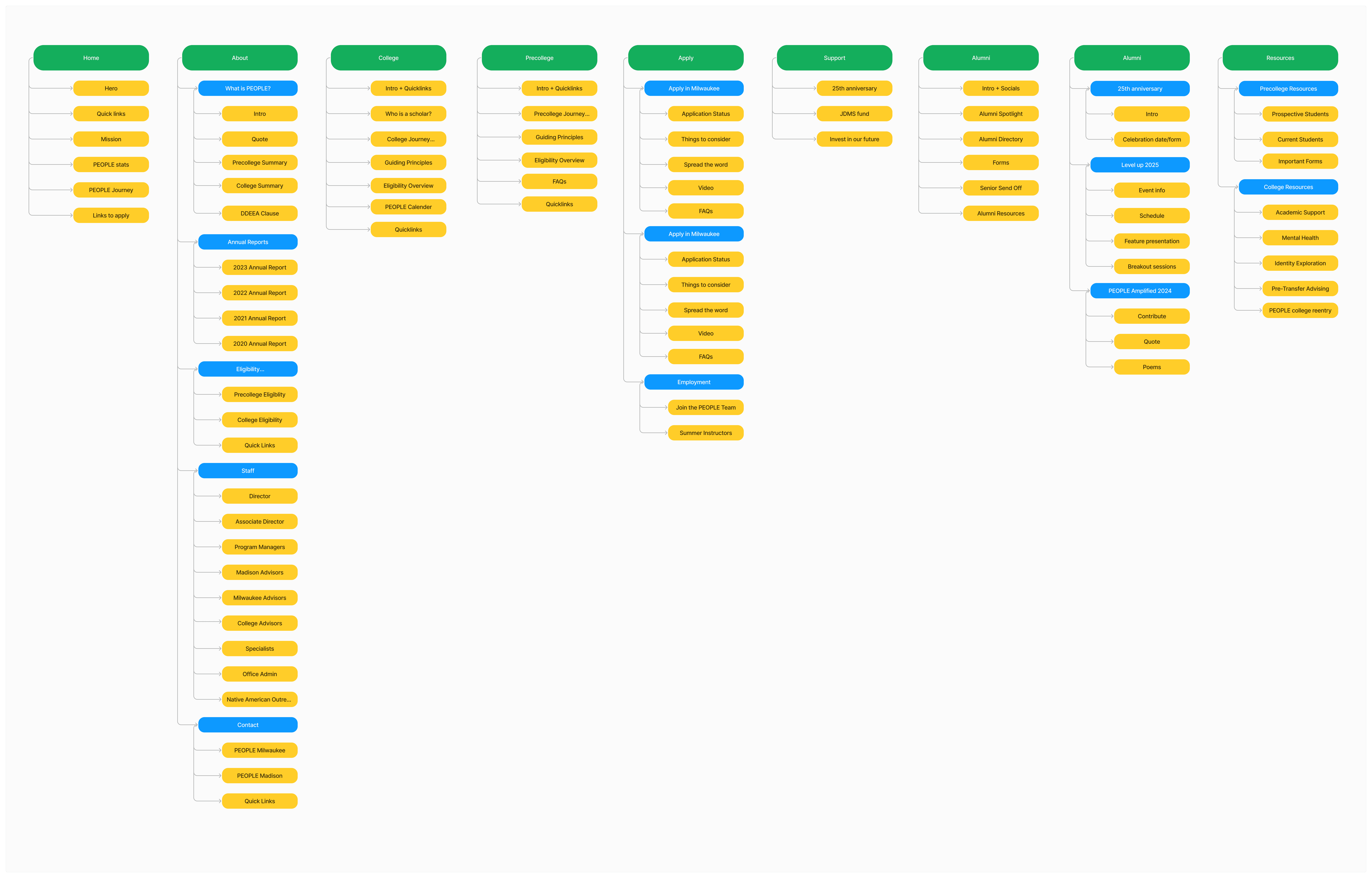
Optimizing the navigation bar was a critical step in this design process, ensuring students and parents could quickly find the information they needed without needing to contact PEOPLE staff.
Optimzing how the website was laid out and what content was where was crucical for this redesign because the main issue was information being disorganized and the absence of an actual system.
With some feedback from my team, I created iterations of sitemaps
Wireframing
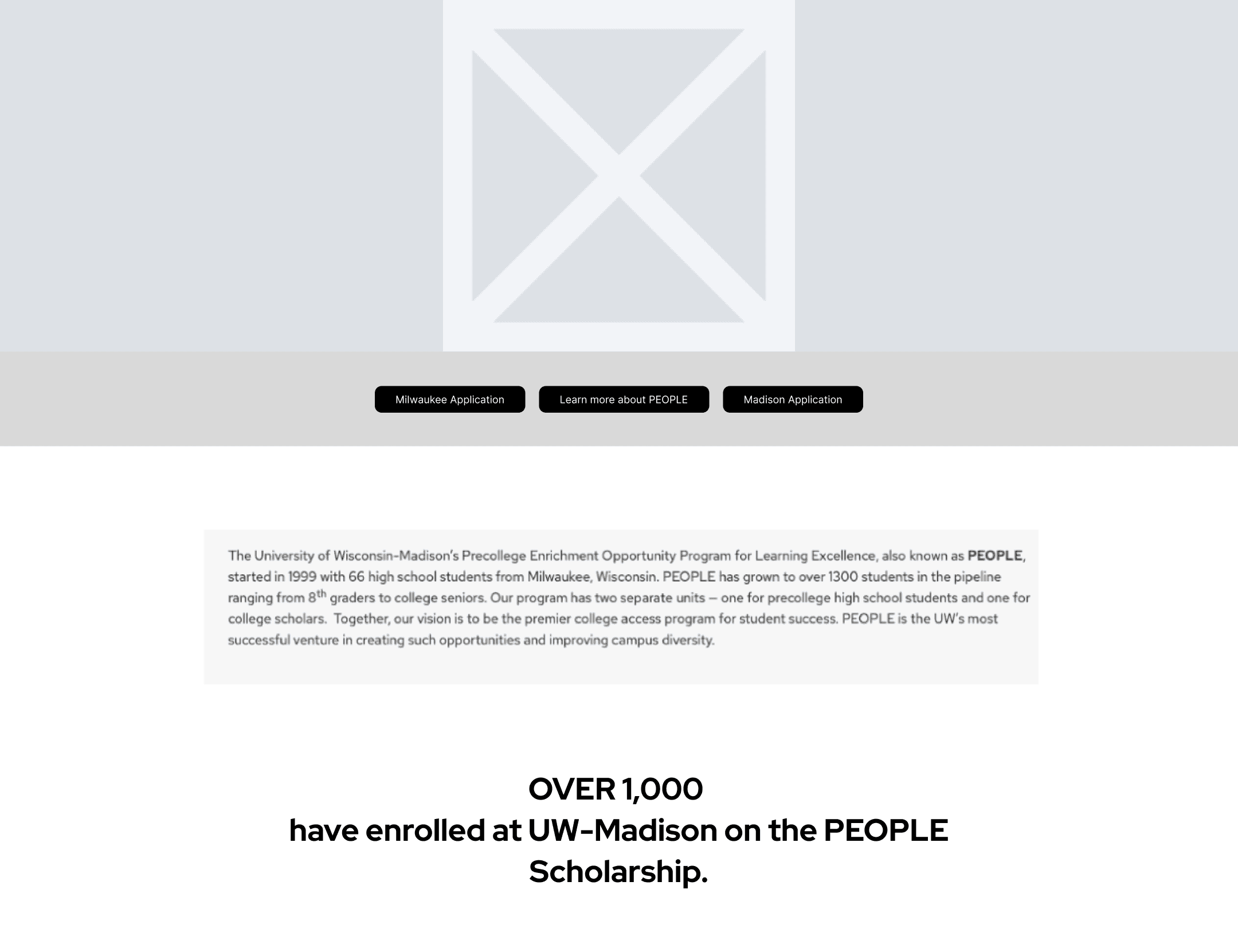
After restructuring the IA, I started to wireframe new page layouts to simplify content and enhance accessibility while keeping in mind the sitemap.
Phase 4: Prototype
Tapping into WordPress & HTML/CSS
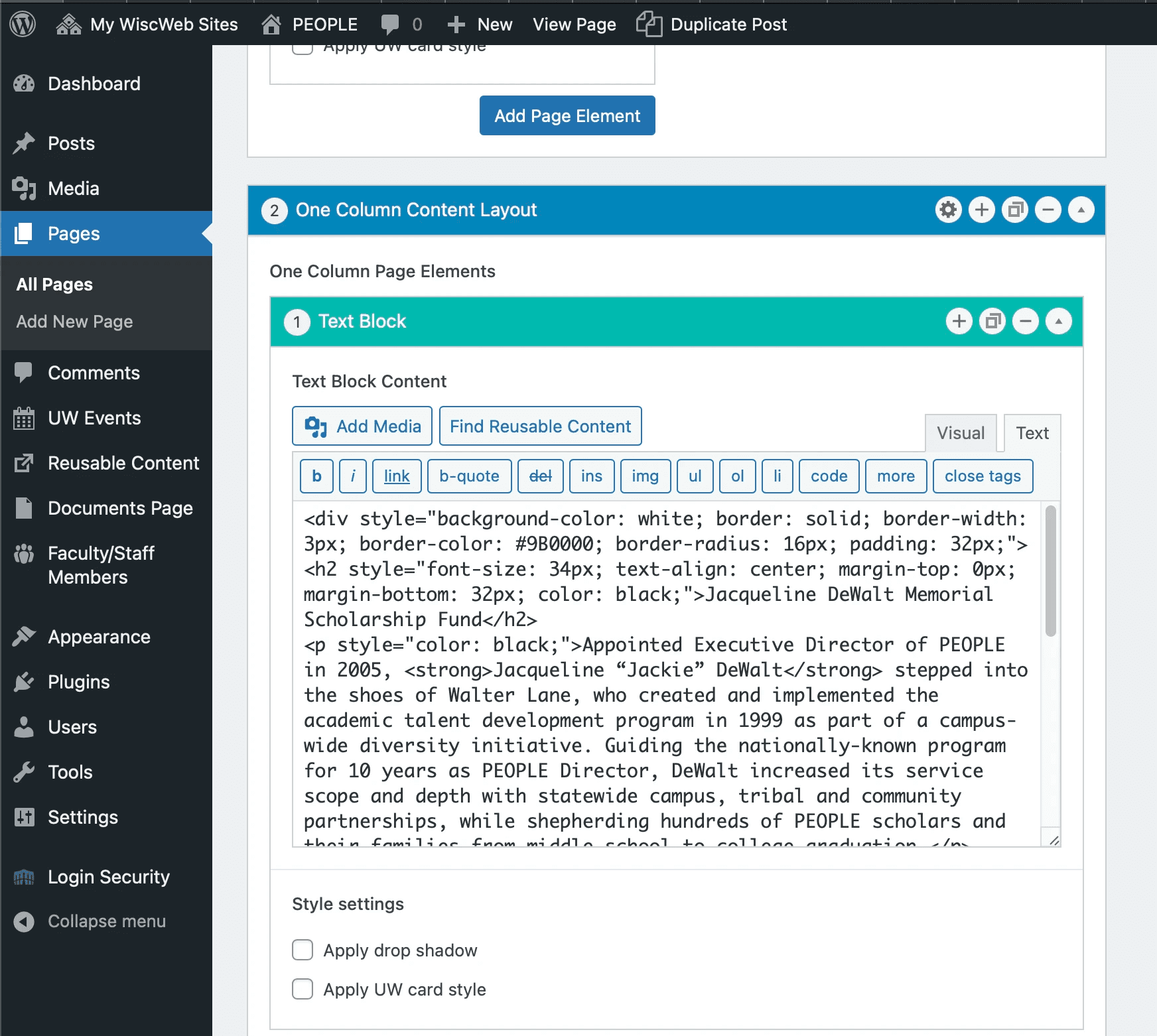
After wireframing in Figma, I used WordPress Sandboxes to build and test each page before launching the redesign on the live site.
Learning HTML/CSS & Wordpress
The outdated UW version of WordPress had limited design flexibility (but included an coding feature).
So I taught myself HTML/CSS to utilitze WordPress's coding feature and create a cohesive, visually appealing, and user-friendly site.
New Navigation bar based on sitemaps
The main change was the navigation bar, redesigned to guide users more effectively. After several iterations, we finalized a navigation structure (based on the sitemap above) that aligned with both user needs and program goals.

In addition to the nav bar, I added Quicklinks bars to help students navigate the website and guide them through the process of learning about the program.

UI Design system
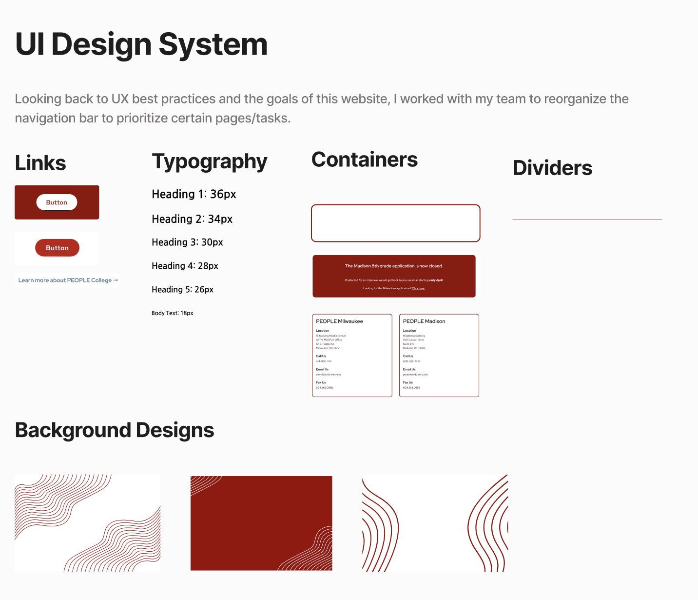
While using existing UW components, I created and coded reusable elements for cards, headings, buttons, dividers, and background visuals.
Phase 5: Test & Review
Launching Live Site
The PEOPLE website was launched and received very positive feedback from both staff and students.
Content is regularly updated, and staff now rely on it as a key resource.
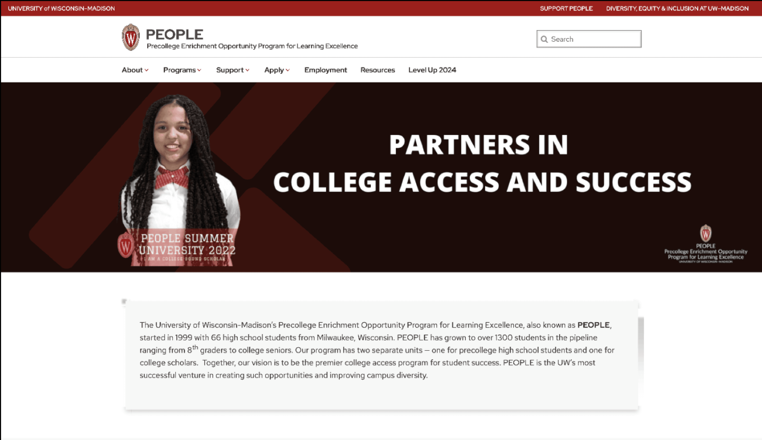
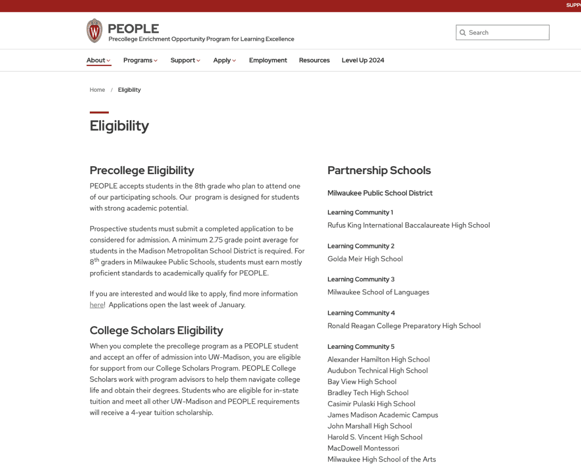
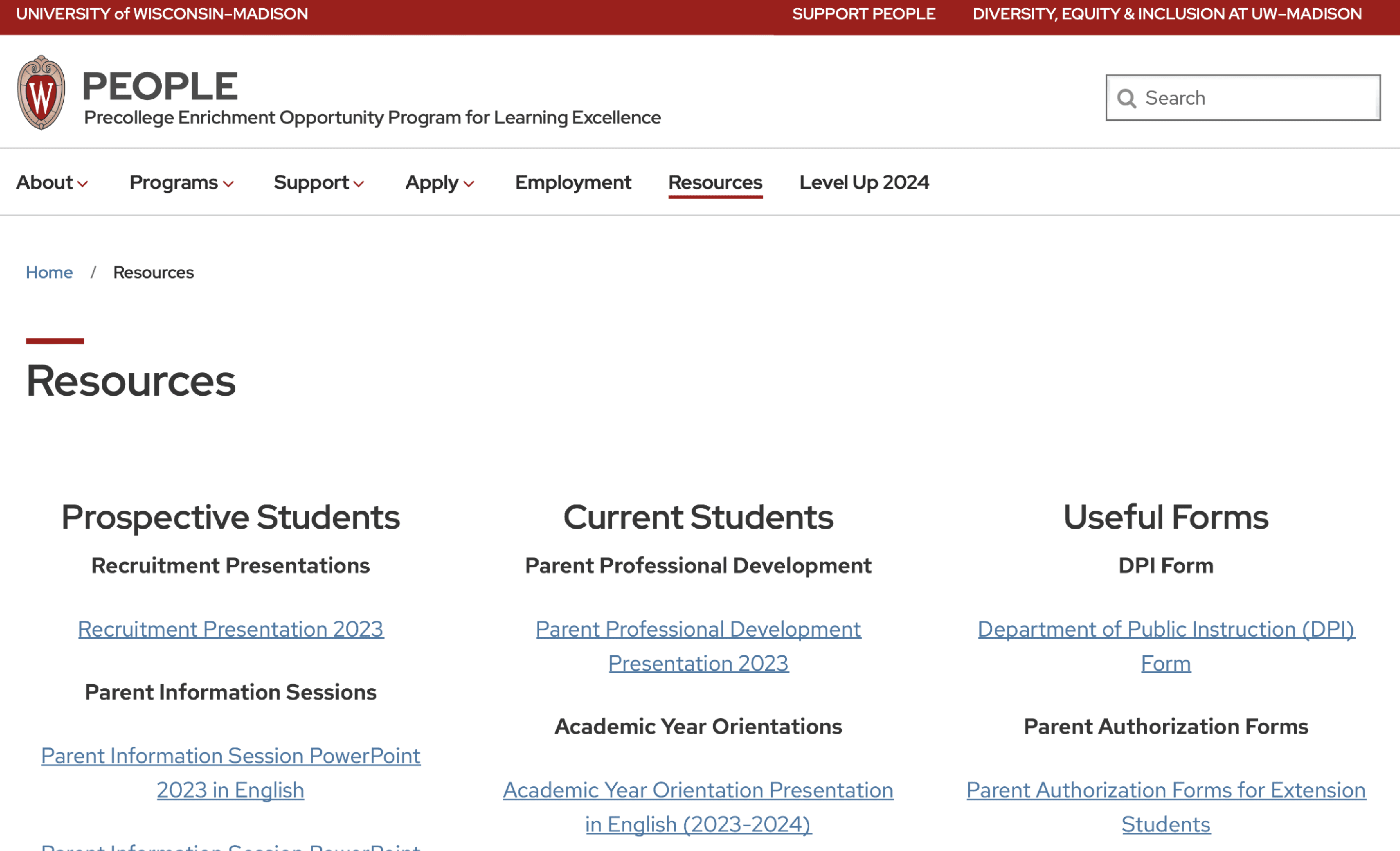
Old Website
Below is screenshots of the old website featuring the homepage, the eligibility page, the resources page, and the old navigation bar.
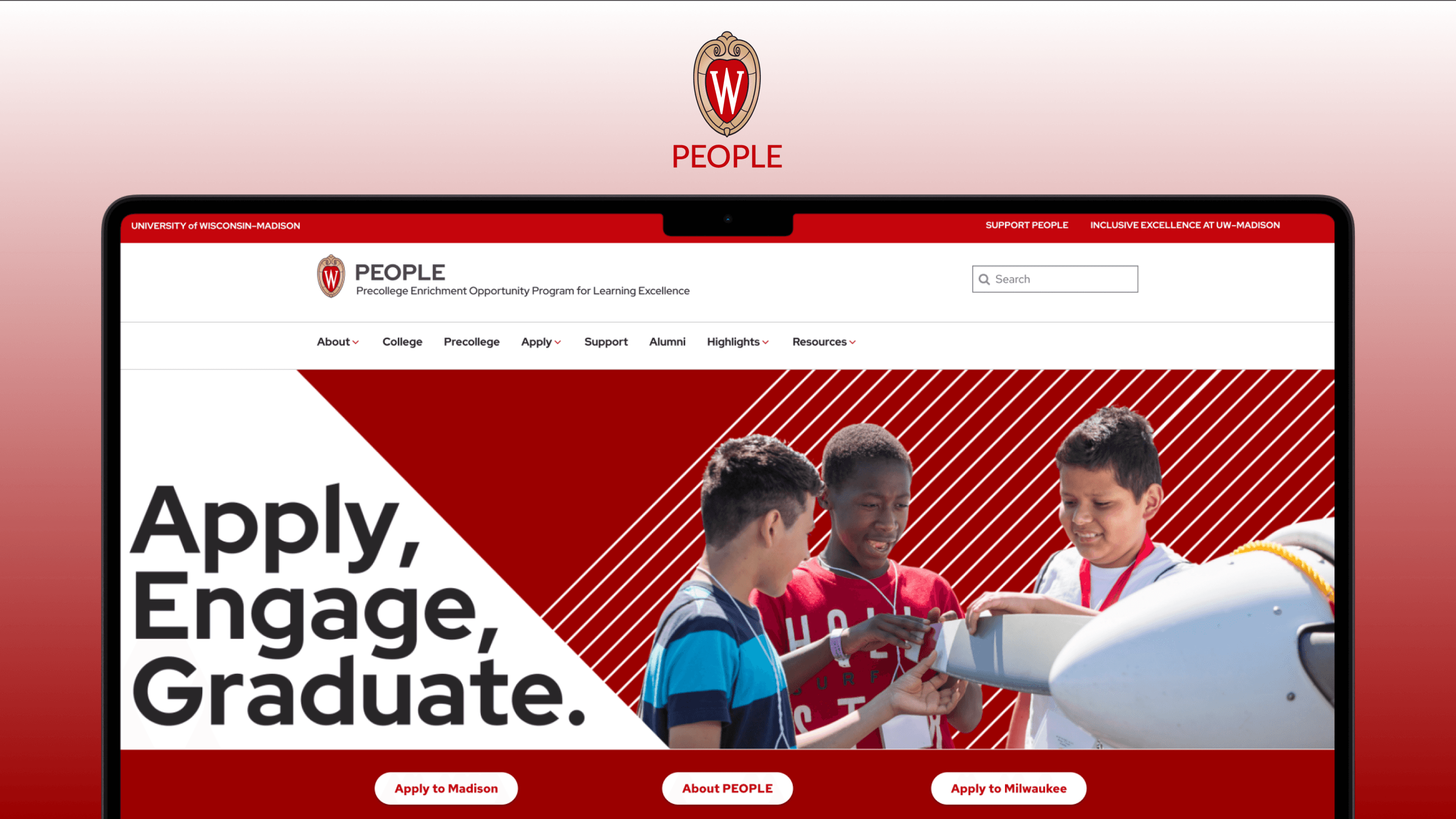
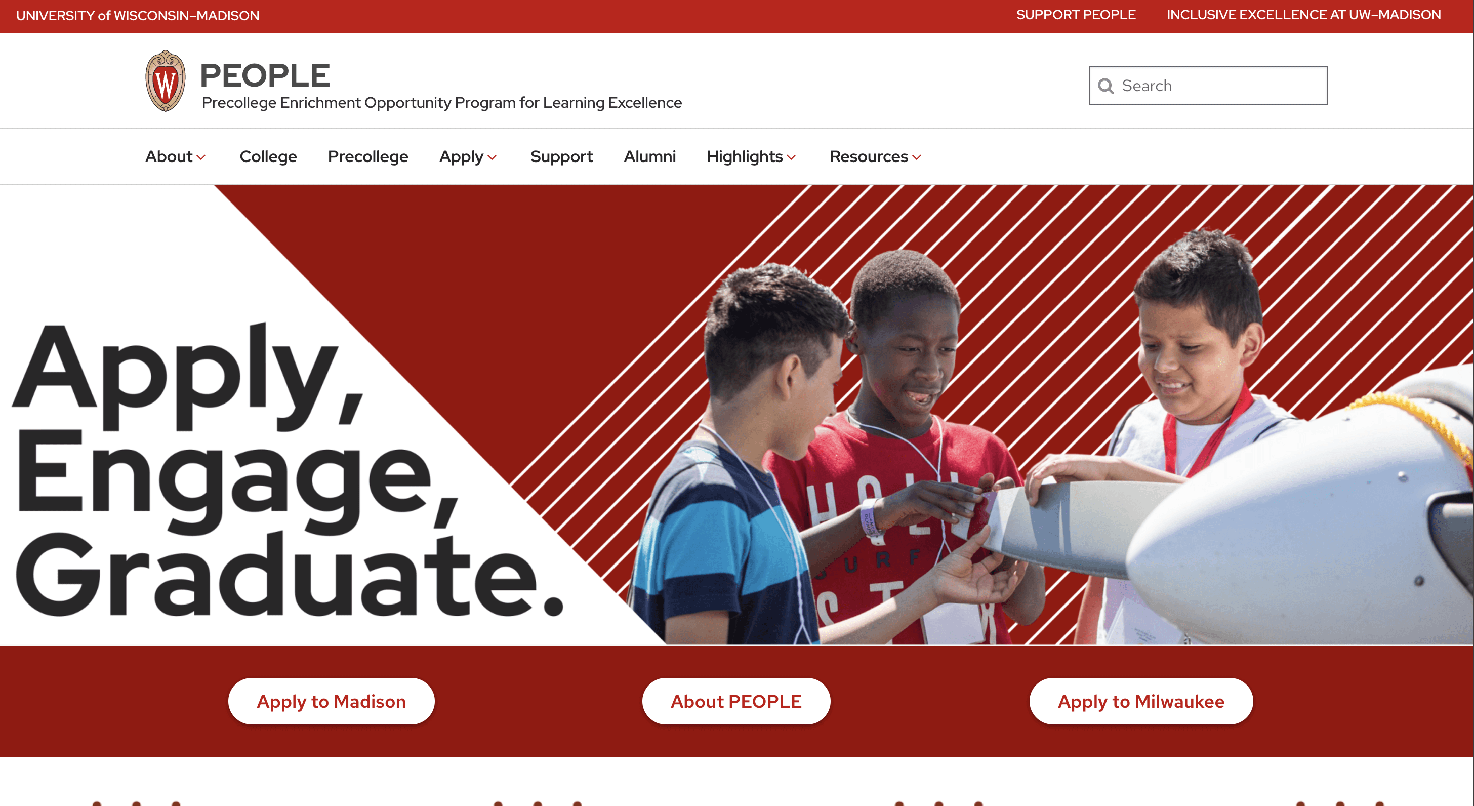
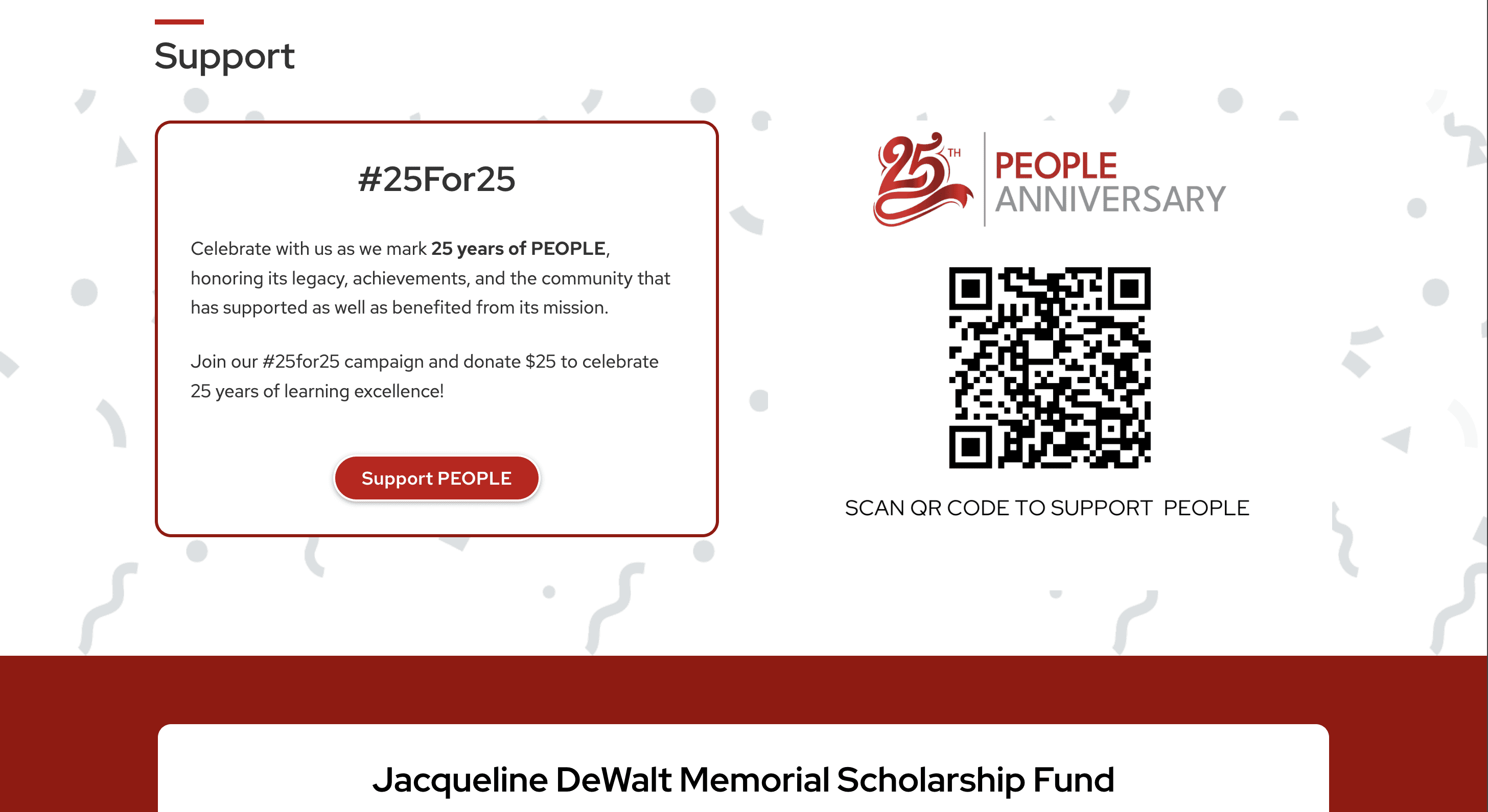
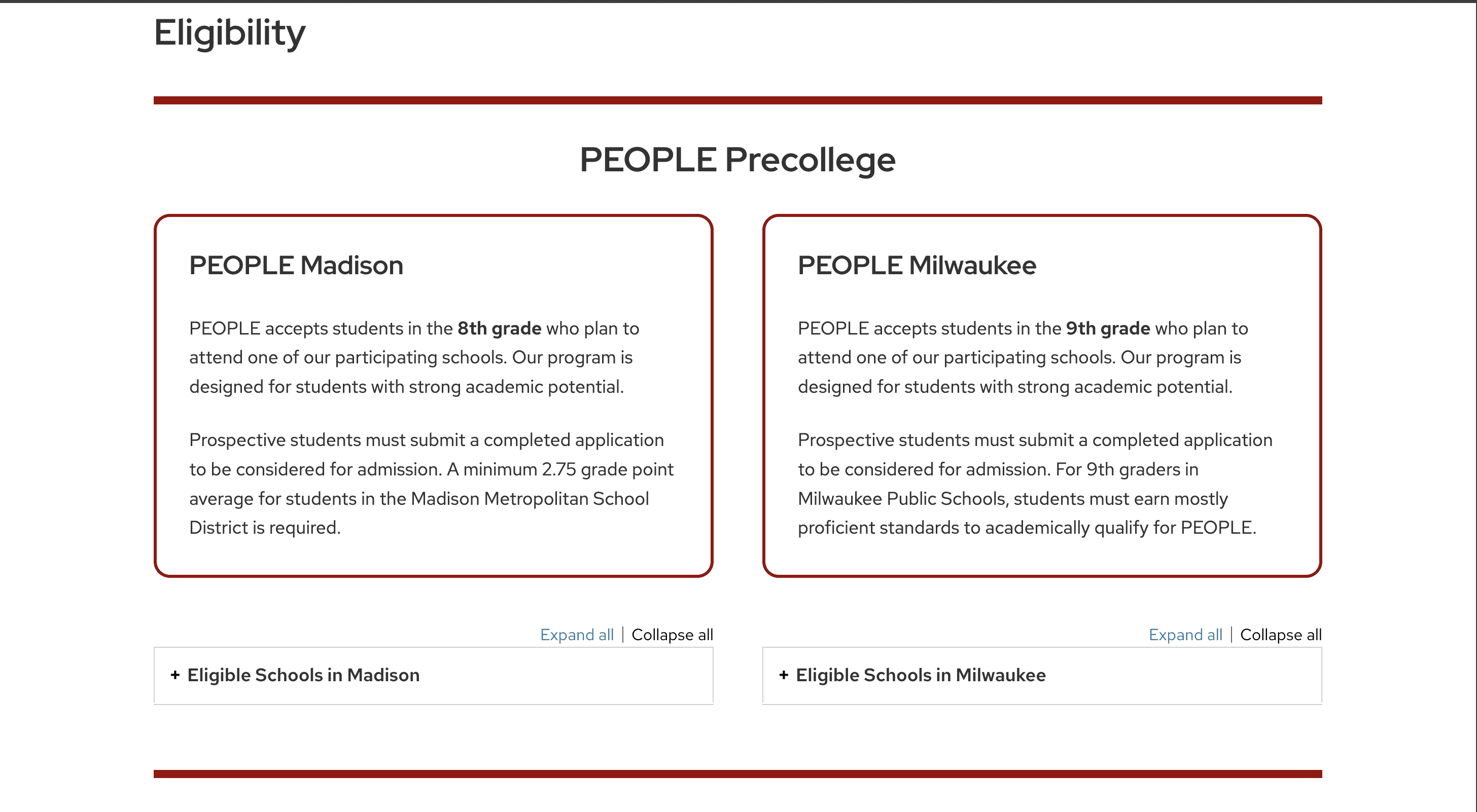
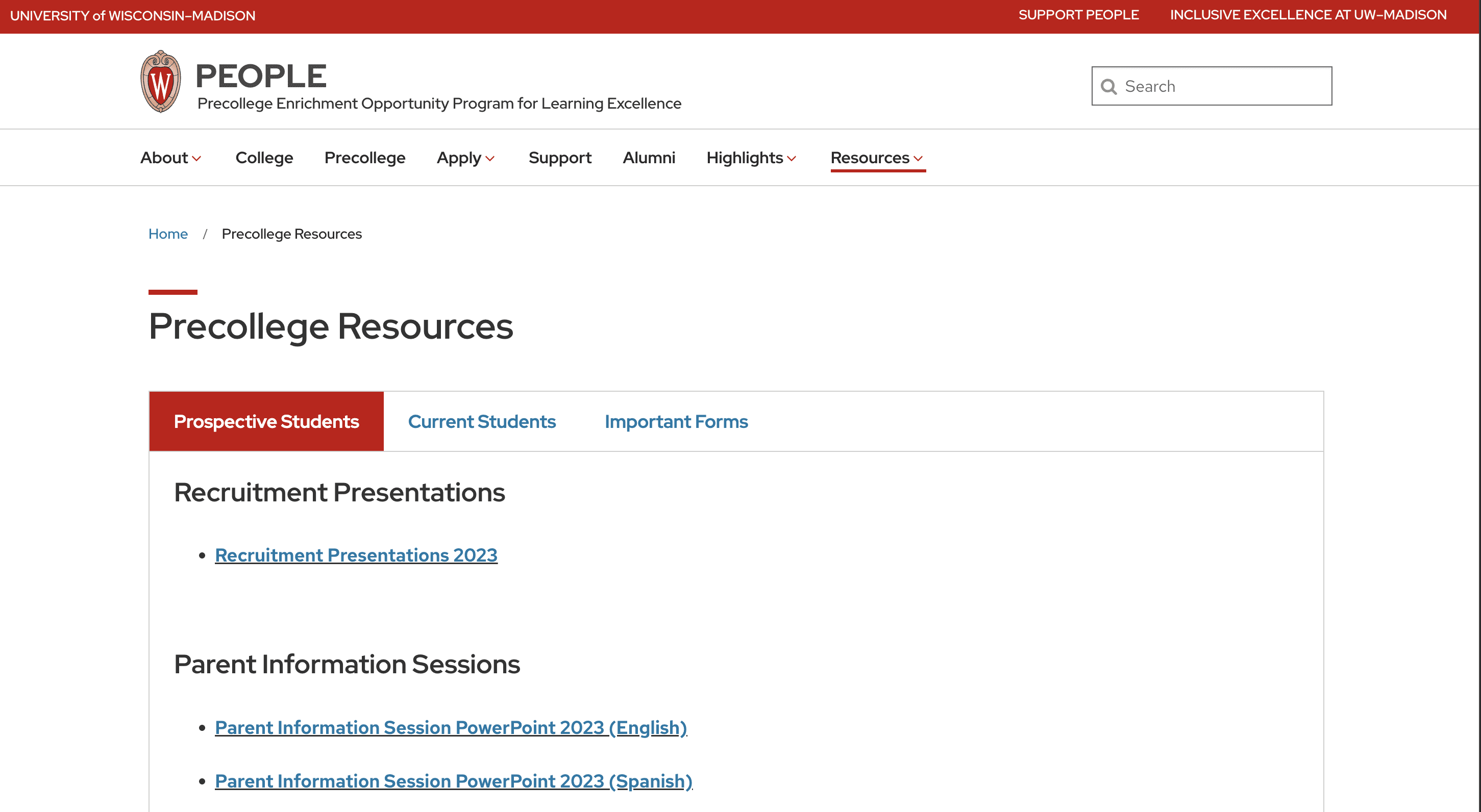
New and Improved PEOPLE Website
Below are screenshots of the new live version of the PEOPLE website featuring the homeapge, the support page, the eligibility page, the resources page, and the new navigation bar.
Lighthouse testing
After the website launched, I did a lighthouse audit to look at not only accessibility, but performance, best practices, and SEO.
Key Takeaways & Challenges
01
02
Reorganizing large amounts of information for a big organization requires time, teamwork, and communication, but ultimately makes the content more digestible for users.
03
Clear goals and communication from my team made the redesign process smoother, as I understood the concerns from the start and received consistent feedback.
Reflection & Whats Next
I'm glad I took on this project as it pushed me to learn new skills and collaborate with people who, while not design experts, deeply understand the needs of the students, parents, and the program itself.
It was a unique experience with a lot of responsibility, requiring me to learn on the go. While there were frustrating days of problem-solving alone, there were also rewarding moments redesigning the site using new tools and techniques that I found a new passion for.
The best part of this project is knowing that students and parents now have a reliable resource, whether they’re prospective students applying for a scholarship or current scholars seeking academic support. As a former scholar myself, it was incredibly rewarding to give back to the community that has supported me for the past 7 years.
View More Case Studies
Look through case studies about projects I've worked on at my job and at school.

