PEOPLE Website
As a graphic/web design intern at the PEOPLE program, I led a UI/UX redesign of the PEOPLE website to improve its information architecture & usability for students, parents, and staff.
Duration
8-9 months (>4 hours per week since I was part-time)
Role
UX Researcher
Sole UX/UI Designer
Toolkit
Figma
Google docs
Adobe Creative Cloud
INTRODUCTION
Problem + Goal
What’s the problem?
This website redesign was a response to a originally disorganized, inefficient, and outdated interface. These usability and content challenges discouraged students, parents, and even staff from relying on the website for information about the program; despite it being intended as their primary resource.
What’s the goal?
The goal is to rebuild the PEOPLE website so that it reflects the program’s brand and structure. We want students, parents, and staff to find the information they need from our program with ease on this new website.
DISCOVER
My Design Framework: Double Diamond Method
For all designs, I try my best to follow the Double Diamond Method. Shoutout to my Design & Business Professor, Giustina Parisi, for introducing me to this method.
DISCOVER
DISCOVER
DISCOVER
Competitive Analysis
Since we are a part of the UW-Madison system, there were countless of websites that used the same website-builder and UW style guide as us.
So I took the time to look through 5-6 websites and take note of what we should aim for and avoid.
DISCOVER
Website Analysis
Using insights from the competitive analysis, I carried out a holistic and a page-by-page evaluation of the website, documenting strengths and opportunities for improvement.
Afterwards, I facilitated a collaborative walkthrough with my team to align on findings and next steps.
DEFINE
DEFINE
DEFINE
Turning Data into Core Insights
After analyzing the current PEOPLE Program website and meeting with the team, I identified three key insights to guide my redesign.

The website lacked a clear user flow and intuitive structure.

Core components were found to have accessibility issues.

Each page contained too much content and information that felt overwhelming.
DEVELOP
DEVELOP
DEVELOP
Creating Solutions for Users
Using these insights, I developed three preliminary solutions that informed the designs addressing the issues above.
Simplify the navigation and content structure to reflect the program structure.
Create a WCAG AAA-compliant UI design system and audit the site to resolve accessibility issues.
Refine content to clearly convey the program’s purpose and key information for users.
DEVELOP
Sitemapping
To begin the design process, I mapped out the information architecture and discussed key usability issues with my team.
After analyzing the original website, we created a new site map aligned with the program’s structure and the needs of its students.
DEVELOP
Wireframing
With the overall structure finalized, I moved into Figma to design individual pages where I focused on refreshing the UI, refining content, and improving user flows.
DEVELOP
WordPress + CSS
Once I had my designs in figma, I translated them into WordPress using the existing content layouts and additional CSS.
DELIVER
DELIVER
DELIVER
Old vs New Website
On the left is an example of where the website was before the redesign and a few of the many issues we fixed in the latest version. On the right, there is the same page, but updated with comments on what changed.
DELIVER
Highlight: Navigation Bar
A key part of this redesign was rethinking the navigation bar to align with the new information architecture, which naturally shaped the user flows throughout the site.
DELIVER
Highlight: Fixing Accessibility Issues
Throughout the design and development process, I prioritized accessibility which included adding alt text for images, ensuring color contrast met WCAG AAA standards, and following best practices for inclusive design.
After launching the final site on WordPress, I used the WAVE tool to identify and resolve accessibility issues, then ran Google Lighthouse audits to evaluate accessibility and overall site performance.


DELIVER
Key Screens
Below are a few key screens that encapsulate cohesive user friendly UI design system, clear CTAs, prioritization of key information, and an overall better user flow experience.
WRAPPING UP
WRAPPING UP
WRAPPING UP
Final Website
Below is a demo through the current live PEOPLE Program.
WRAPPING UP
Impact
Increased overall engagement from students, parents, and staff.
Post-redesign accessibility audits showed consistently strong scores, nearing perfect ratings.
The website became a primary channel for sharing program updates and promoting upcoming events.
WRAPPING UP
Challenges + Reflection
Team Communication
For much of the project, I worked independently and found it challenging to wait on feedback from others. To address this, I began scheduling monthly team check-ins to share progress, gather input, and ensure alignment throughout the process.
Designing Under Constraints
Since the program is a non-profit and funding was reduced several times during my internship, I often had to work with limited resources and tight timelines. I relied on external tools and research, stayed adaptable, and pushed myself to meet project goals despite the constraints.
MORE CASE STUDIES
MORE CASE STUDIES
Explore Other Case Studies
-
![]()
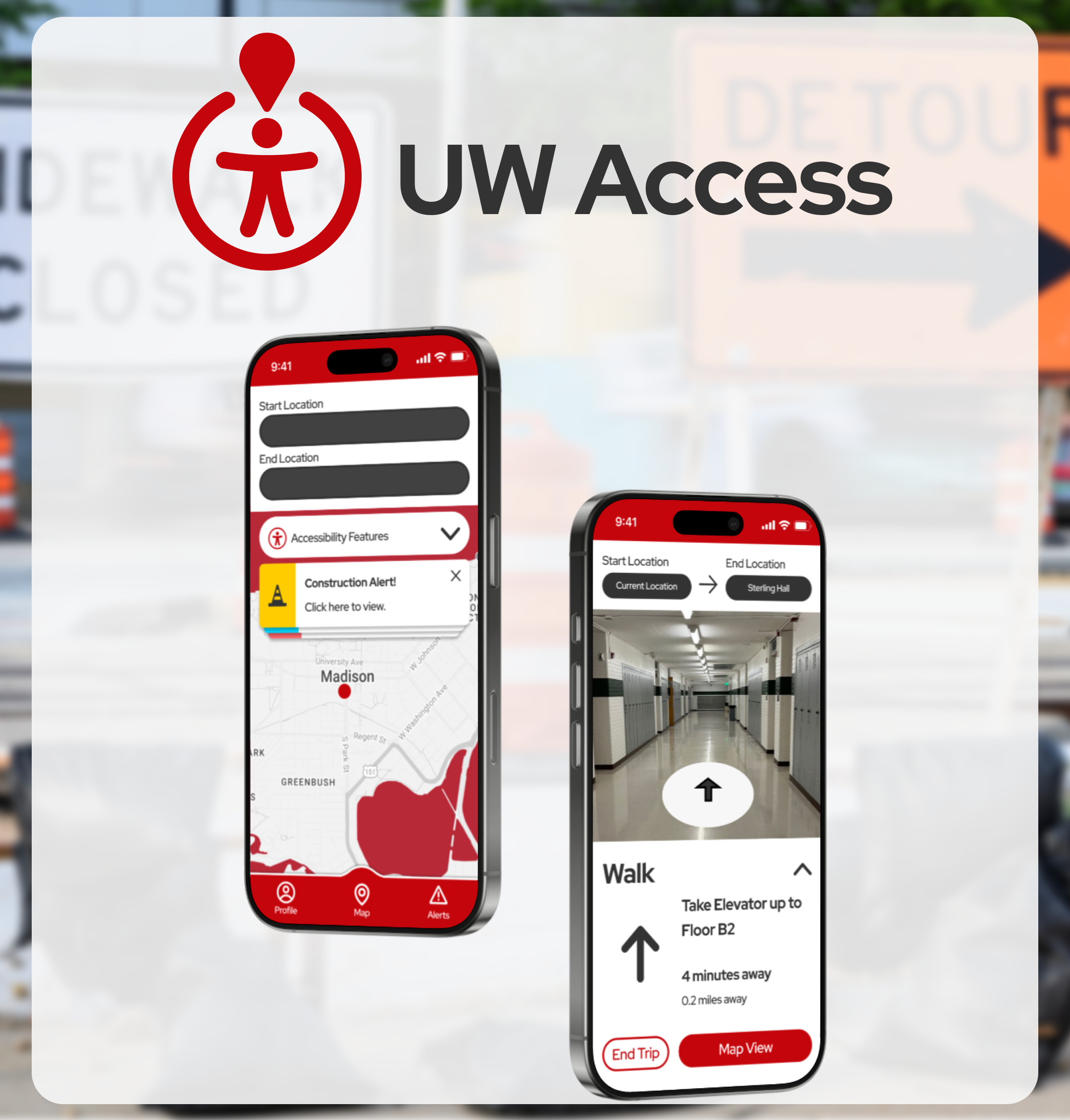
UWAccess
A mobile application that improves campus navigation for UW-Madison students with mobility issues
-
![]()
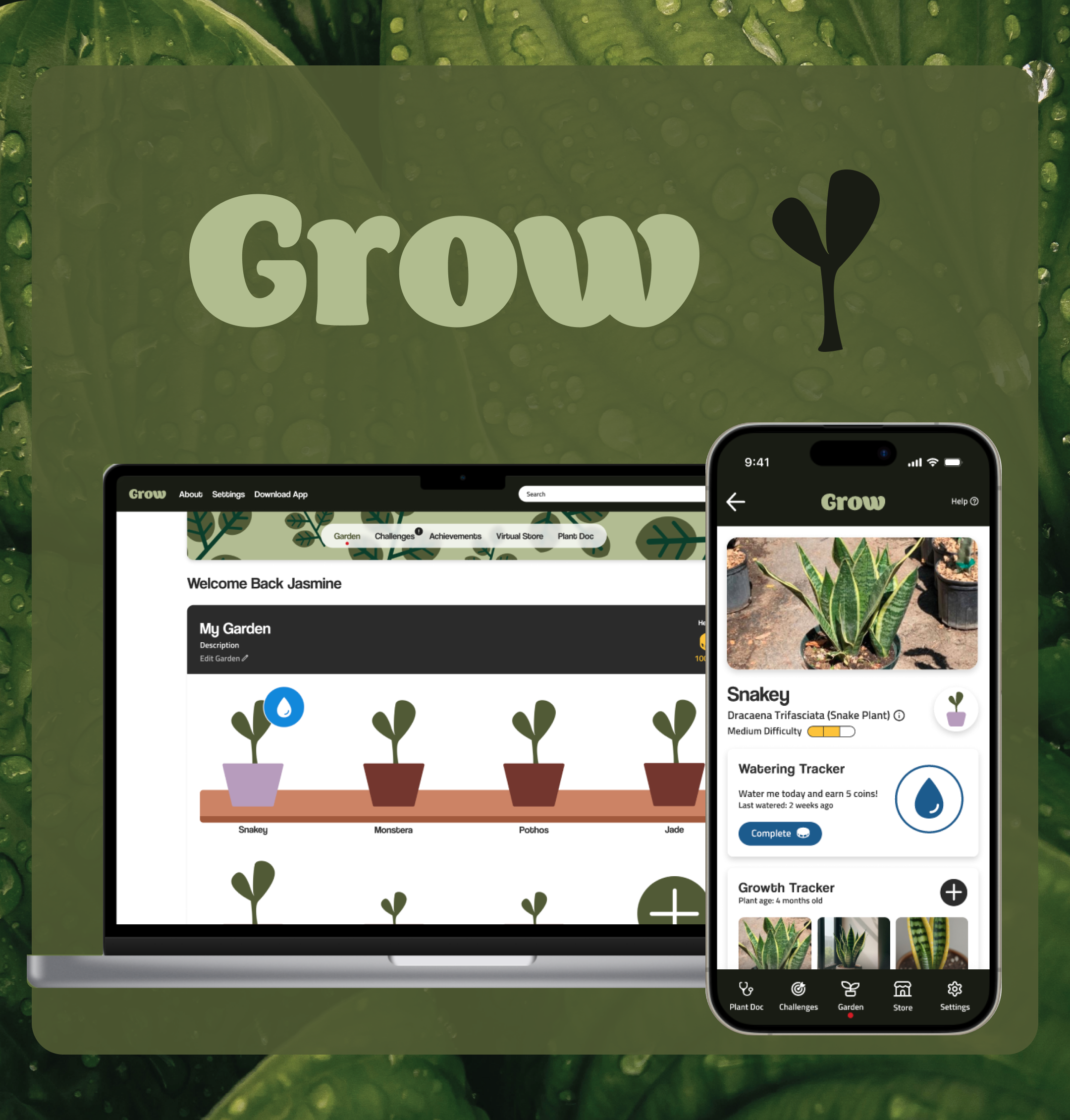
Grow
A gamified plant care app where users grow their own virtual garden, complete fun challenges, earn rewards, and get quick answers to all their plant questions.
-
![]()
Brady Corporation
A website redesign for BradyID’s 17 corporate pages, including about, careers, sustainability, and more.